Flatiron EHR
Design an easy-viewing EMR to improve the workflow efficiency of Oncologists

Overview
This was a design sprint held by Flatiron. The goal of this design sprint was to build a user-friendly dashboard to solve the problem of oncologists spend too much time on reviewing the EMR. My role involved in storyboarding, paper prototyping, and interaction design. After the design sprint, I took it further with the feedbacks we received, made improvements on information architecture, designed the new UI, and built the digital prototype.
Role Interaction Design, Digital Prototyping, Product Thinking
Type Design Sprint
Time 3 hours (2019 Feb)
Tool Paper Sketch
How might we
Design an EMR for Oncologists to better review cancer patient’s medication in a follow-up visit ?
Design Requirement:
Must show context of all medicines a doctor is administering, the dates the drugs need to be taken, where that date falls in the course of treatment (cycle X, day Y), have details about the drugs on demandExample Regimen:
CARBOplatin AUC 6 + Pemetrexed 500 mg/m2 + Bevacizumab 15 mg/kg q3w x 6 cycles
The Solution
SmartView- Spend less time on EHR, more on what really matters
An easy-viewing EMR for Ontologists to quickly review patient medication information. Through graphs and charts, Ontologists can quickly understand patient current status, symptom progress, medication intake and physical reactions to facilitate the decision making process.

Treatment Summary, at a glance
No hassles to search previous patient’s data in the dashboard. A treatment summary gathers all information you need in one united tab. Just seconds to review patient’s health before a visit.
Easy-viewing Medication Tables
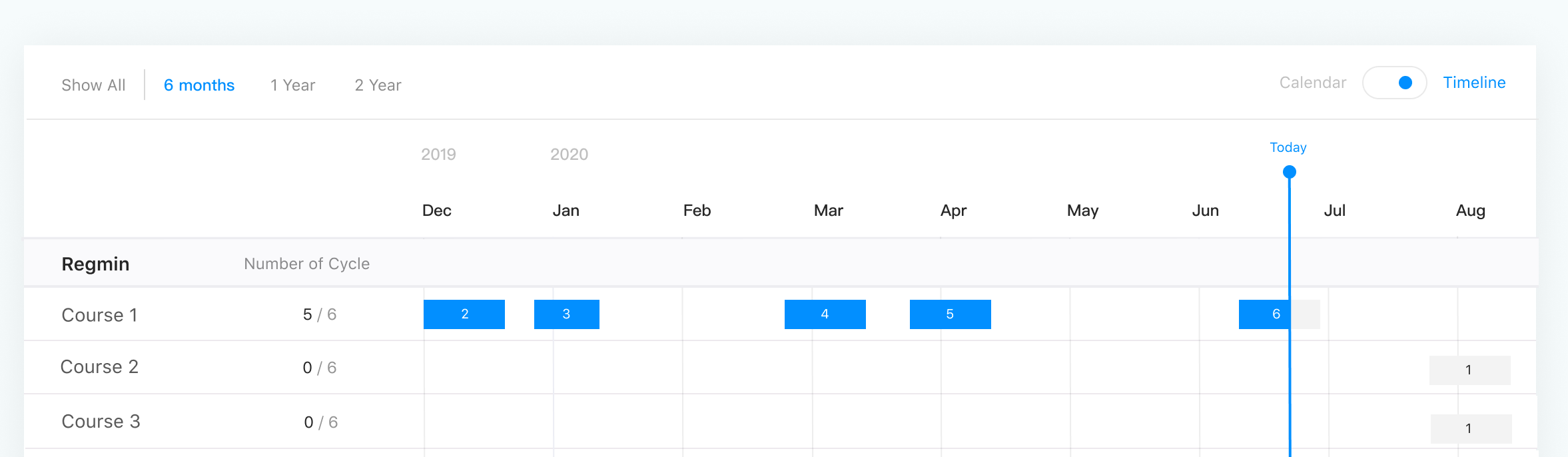
Built for read quickly for Oncology practices’ variety tasks. "Calendar Views" supports checking detailed medication while "Timeline Views" allow doctors to review regimens by months, by years, or on demand.


Feature Instructions
Say good-bye to heavy manuals. The popups give you a guided introduction to the critical features in an interface, and makes learning a new system so effortlessly.
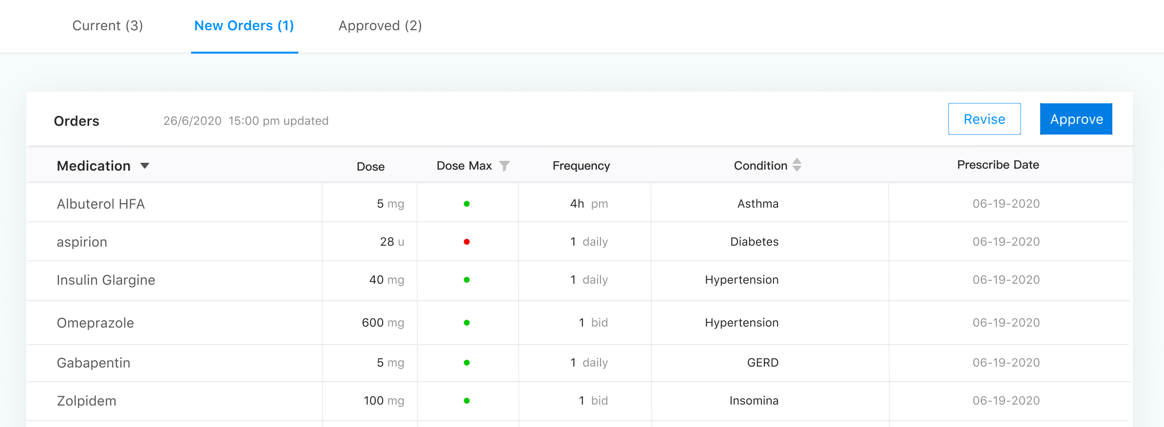
Orders Review and Dosage Alerts
A Order list gives you a quick overview on all the medication you prescribe and notified the ones exceed max dosage.

Research
Understanding the user contexts and needs
I created a quick storyboards to visualize the doctor's experience of a outpatient treatment. Sketching out the scenario helped me understand the treatment steps, and the needs of doctors for a EMR system.
3 critical needs related to the design requirement:
1. Doctors need to quickly review the history of the patient
2. Doctors need to review the medications in different time series.
3. Doctors need to efficiently examine the medication appropriateness before administering.

Comparative Analysis
What are the problems of existing solutions?
I went through some reviews on the oncology EHR reviewing website to learn the problems that they are having with current EMR and unfilled needs. I discovered 4 major gaps that led to doctors’ frustrations.


Difficult to learn
“We need training for easy transition“
Too complex to find desired information
"Too many buttons to navigate around the service”No overview of patients health
”The documentation of past events with no sense of what’s current and how our health has evolved over time.”Mixed Medication Plans
”Current prescriptions mixed with past ones, inconsistent dosage wording, and no link between prescriptions and conditions”
Synthesize
Defining design goals
After gathering all the information, I came up with the design goals to address the user problems found in research.

Structuring user flow
Aligning with the requirement of design sprint, I created a sitemap on two core functions-“Summary“ and “Medication“, and mapped out the related features for each function.

Design Decision 1
Designing efficient layout
Efficient use is doctor cares the most. I adopted the united layout to allow doctors to achieve desired results with minimum efforts. I placed top-priority categories on the left-side column, and the related submenu on the top. This help users to click on the desired category in the least time required (Fitt’s Law), and quickly locate the desired items in the same page without having more clicks.

Design Decision 2
Creating clean style
It was important that the designs were legible when used with vast array health information in the dashboard. I did this by creating a clean visual style that with minimal color use, larger font-size and sufficient color contrast.


Design Decision 3
Presenting medication info in clarity
One of the complexities of this project was displaying medication information in different viewing modes while maintaining clarity for the safety and appropriateness. I listed out all the Oncologist’s tasks, and analyzed pros and cons to decide the best forms to display the information for each user task.
1. Calendar View
Task 1: View ongoing medication

Pros: Show current regime, medications, and timing clearly
Cons: No broader view on whole plan
2. Timeline View
Task 2 : Overview Progress of all regimens
Pros: Show plans in sequence, helps understand all the regimens over the time
Cons: No detail info.
3. Simple List
Task 3: Check the safety of prescribed Medication
Pros: Easy to scan and locate particular items. Good for checking the prescribed medicine easily.
Cons: Hard to show the relations to dates.
Design Decision 3
Adding Popover Instructions
To reduce the learning burden, I used popover to give instant instructions on complicated function such as timeline bar.
Why Popover: to avoid users being distracted by other information on the dashboard

Final Design
3:00pm - Review Treatment Summary

John is a patient of blood cancer who comes into his doctor's office for chemo treatment. When he is meeting with his doctor, his doctor reviews his treatment summary to understand the medical history, the treatment has received and the recent lab results.

3:10pm - Review Current Medication

John talked about his symptoms progress, and the physical reaction to the medication. His doctor reviews his the treatment regimens John is currently on. Each regimen contains between 6-10 individual medications.

3:40 pm - Review Current Medication

His doctor also switch to timeline view to reviews his following treatment regimens to see if any adjustment is needed.


4:00 pm - Review Order before Administering

Before sending John to have his medications administered, his doctor review much of each medication John will be receiving to make sure that the course of treatment is still appropriate.


Reflection
Patient safety comes the first
This design sprint had taught me a lot. Unlike other industry, medical design requires more critical thinkings on design to ensure patient safety. This trained me to think more thorough on the decisions I made and be aware about the data presentation to avoid medication errors. For each screen, I iterated more than 10 times to ensure there won’t be misunderstanding that lead to failed operations. Through the iterations, I gained deep understanding of design principles, efficient information presentation, and color usage. In addition, I also tried atomic design system to maintain a more consistent UI of dashboard to improve the overall learnability.
User knows more than designers in context
Due to the time constraint, I wasn’t able to interview Oncologist in the research phase. When designing the dashboard, I spent a lot of time on figuring out what data would help the Oncologist the most when practicing. Engaging with users is always the best way to design the solution that suits their context. If possible, I would like to run usability testing with Oncologists in order to learn their views on dashboard data and improve the design.